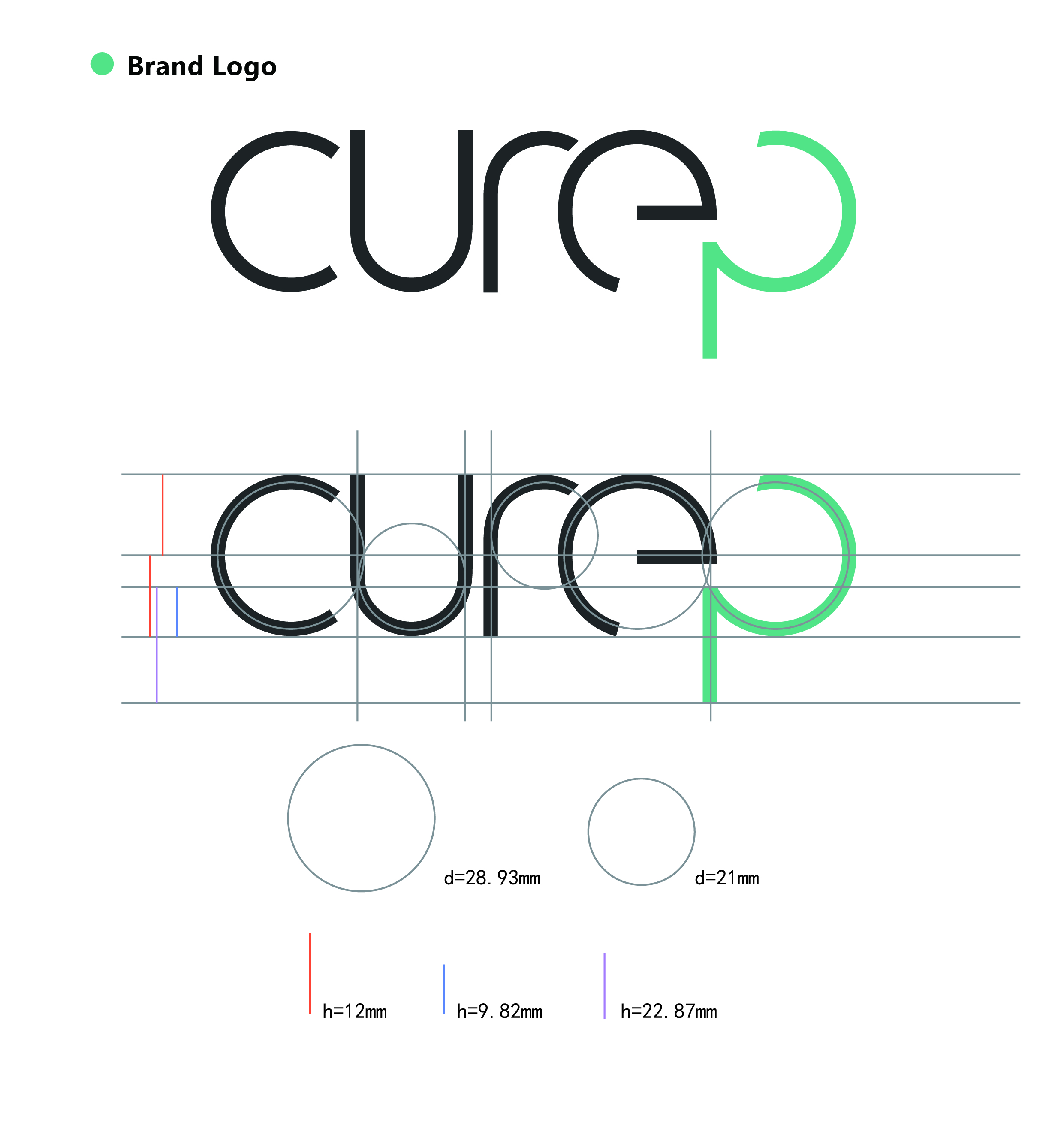
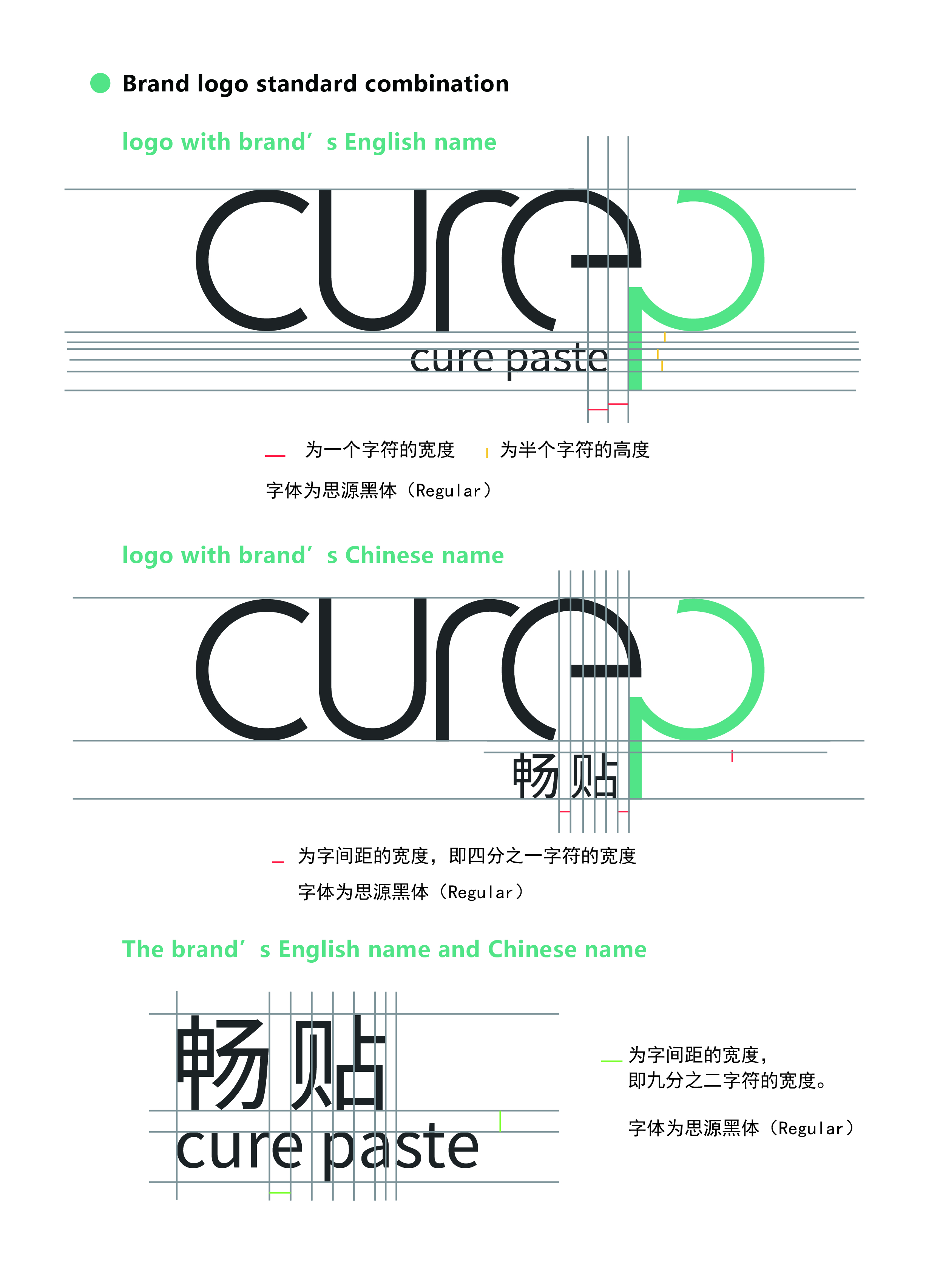
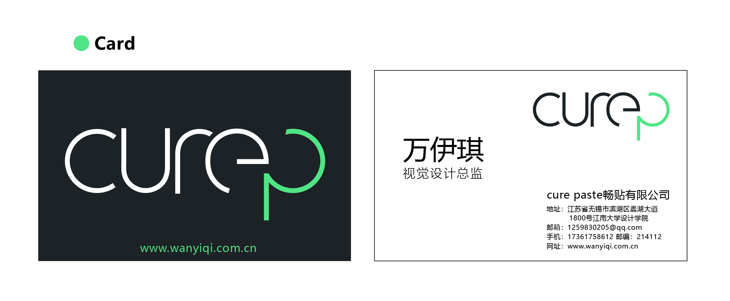
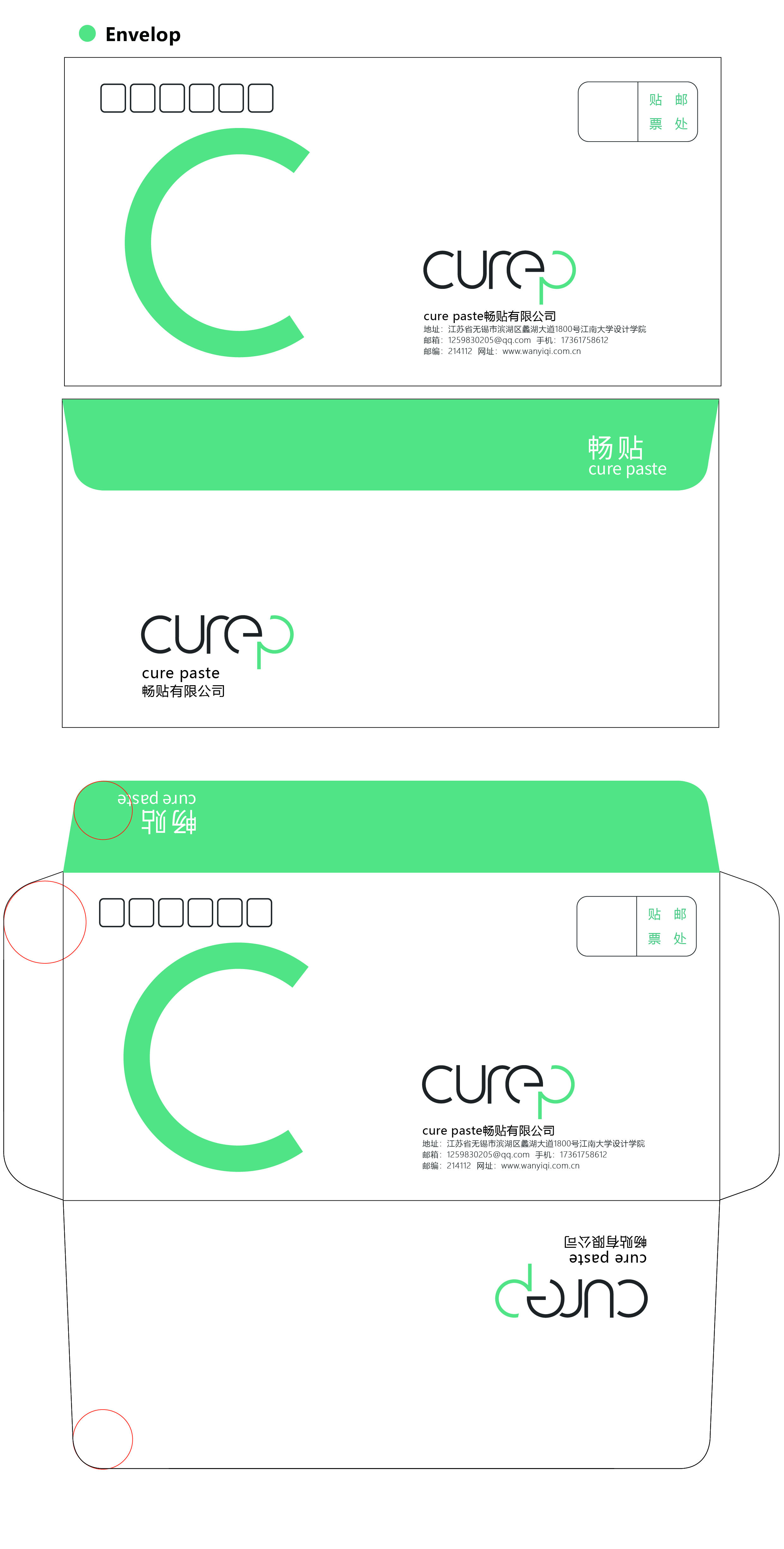
Cure-P
2019/5
There is a VI (Visual Identity) design for a shared-medical system.
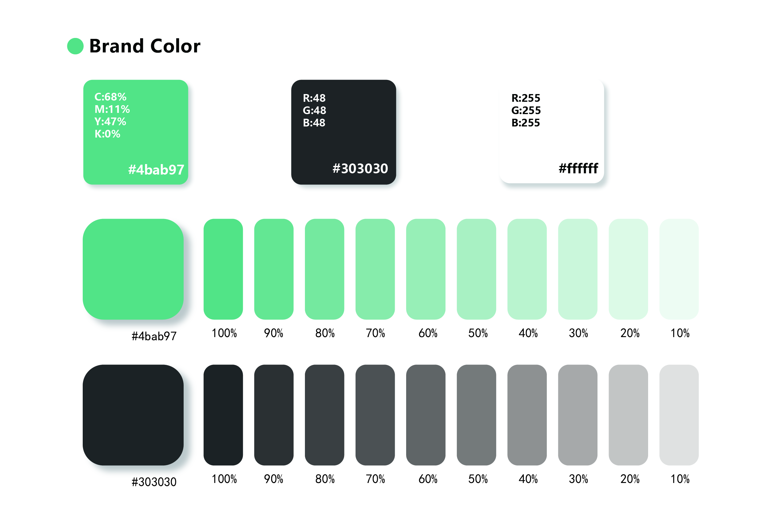
“Cure P” can be called “Cure Paste” and the main product of this system is a medical round massage paste. Therefore, all the letters in the logo are evolved from circles. The main color is green. Because green is the color which is often used in medical settings, it conforms to the concept of health and medical care. Auxiliary color
dark gray and white are suitable for the aesthetic of the most target users (office workers).