
-
-
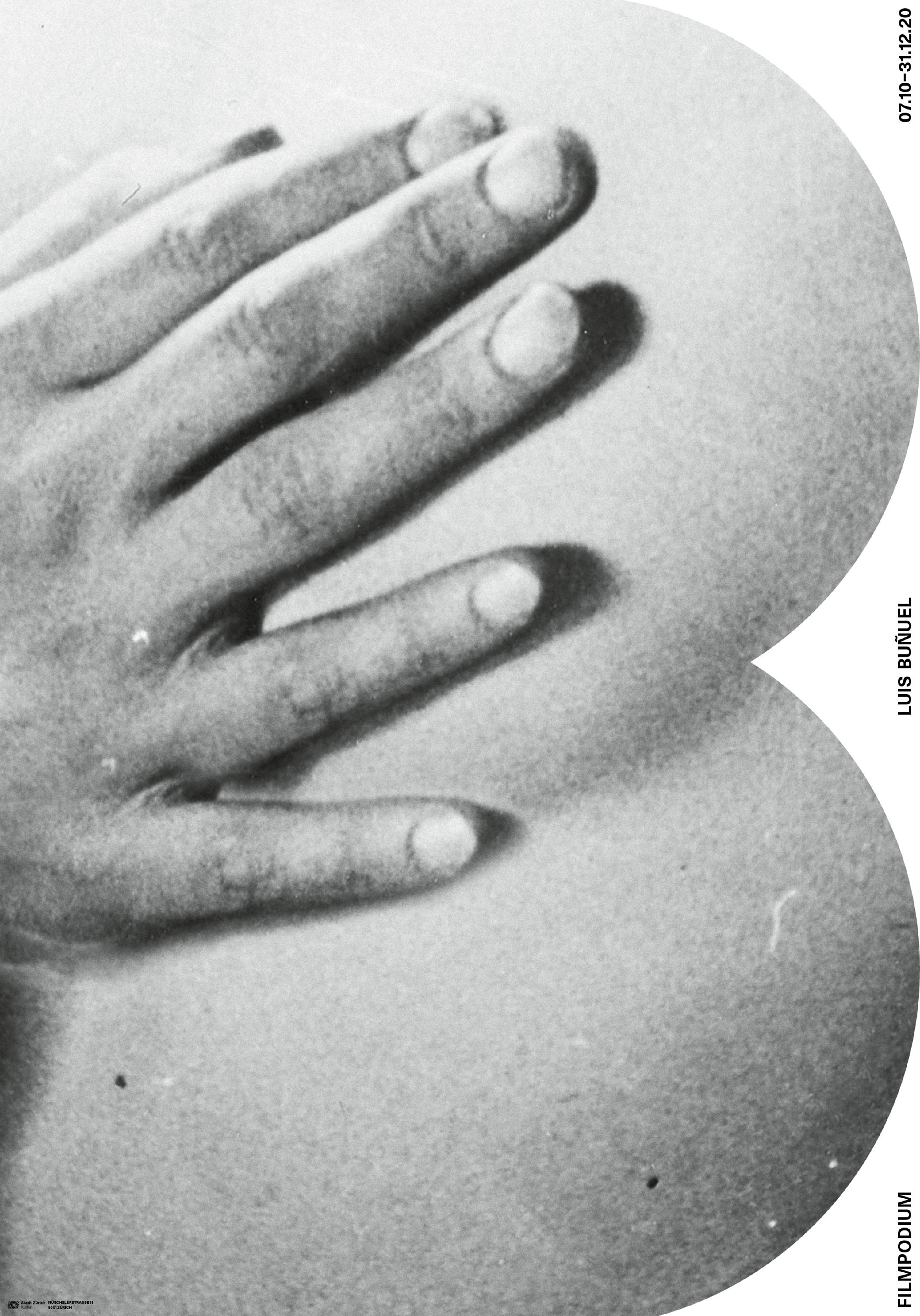
Bunuel places great emphasis on hands and their role in displaying the current mood. A subtle hint to his Surrealist approach is added to this scene in Un chien Andalou.
Between feckless temptresses and powerfull independent females, Bunuels plays with the role of the Women. His Initial emphasizes and hides the female bust and leads speculations open. -
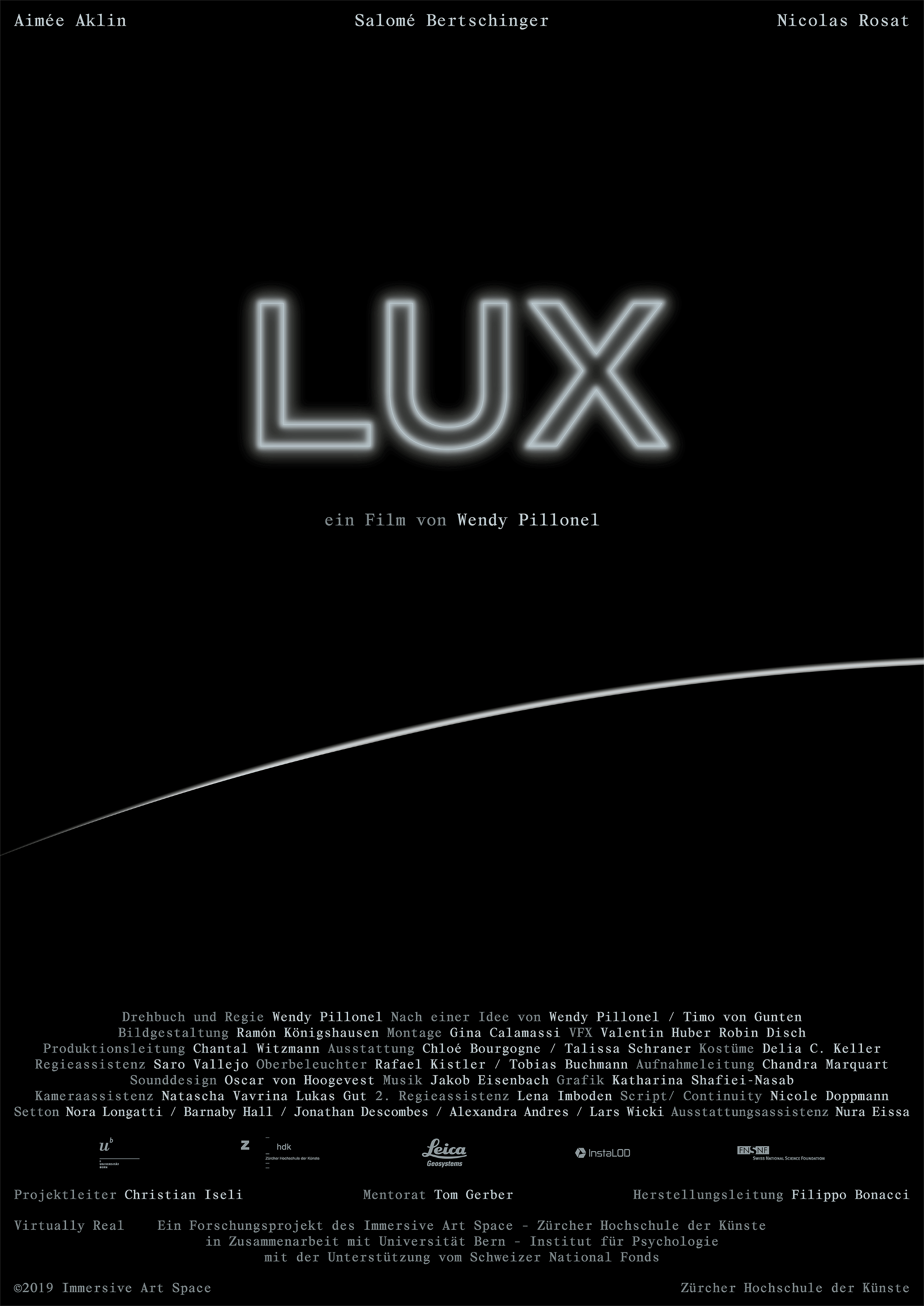
Poster
-
Client
Filmpodium
-
-
-
Created for use in headlines Alias had to display a distinct appearance. Basing the typeface on a grid gave it its contrasting Proportions. With its sharp endings Alias emphasizes the grid. The weights ensure for optimal usage in different applications.
-
3 Weights
- Ask for it
-
-
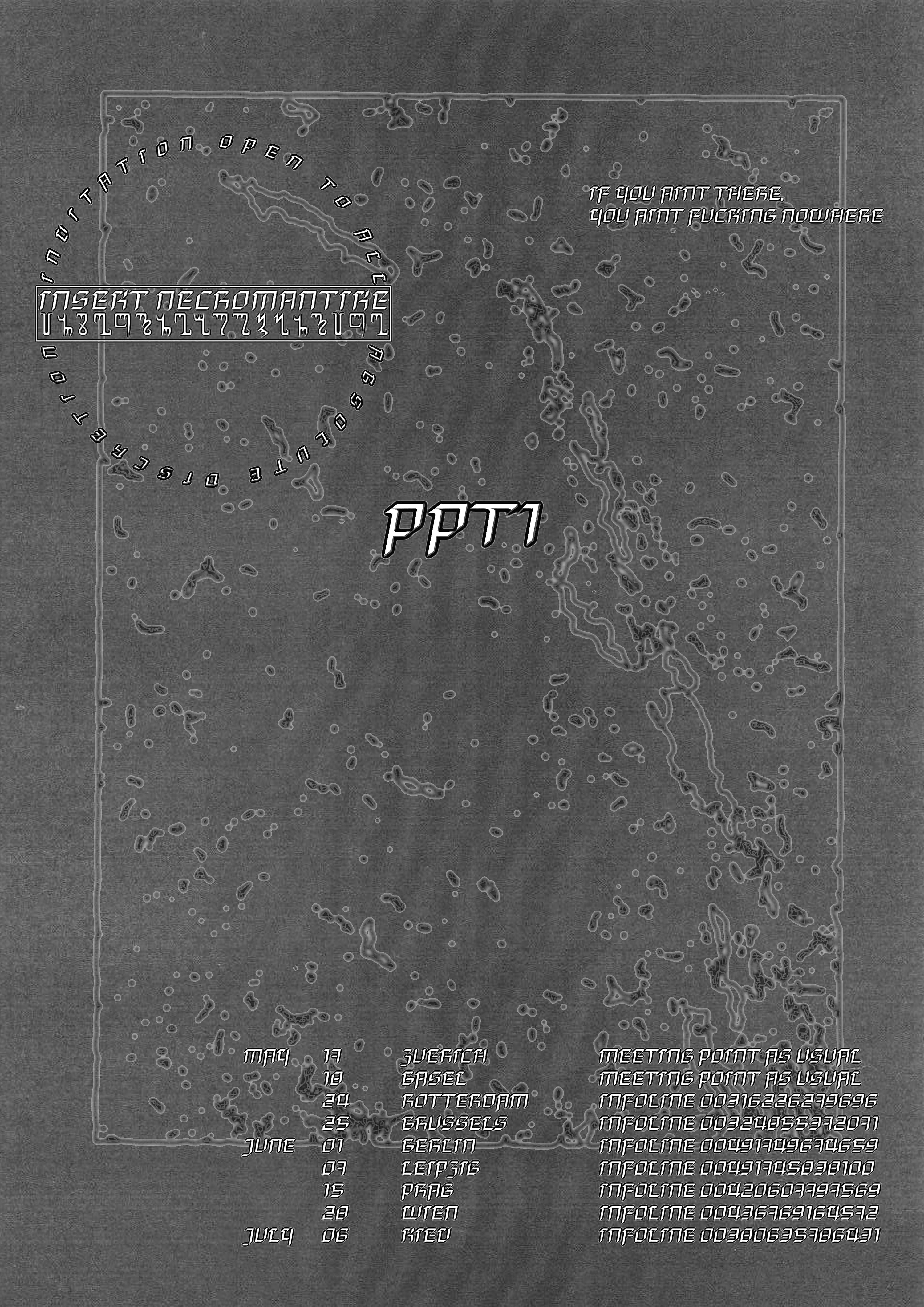
Sippon Genossenschaft Aero-Klub ᏣᎳᎩ ᏍᎦᏯ ᎩᎦᎨᏱ
-
Sippon
The Typeface is multilingual. The syllabary designed by Sequoyah bears common design elements and stress to the latin alphabet.
-
-
MALIMA
HILLSIDE COSMIC SENCHA SLOWRISE APEX-
Malima
Designed for a small Zine Malima uses specific decorativ elements and sharp shapes that are based on a strict grid.
-
-
-
Nur im Kampf liegt die Schönheit – Futurist Manifesto
The project consist of photography, animation and editorial deisgn. The nerfguns functions as a Element of the futurist that trouth color change in meaning. -
Photography
Editorial Design
Animation -
Self iniated Project
-
-
-
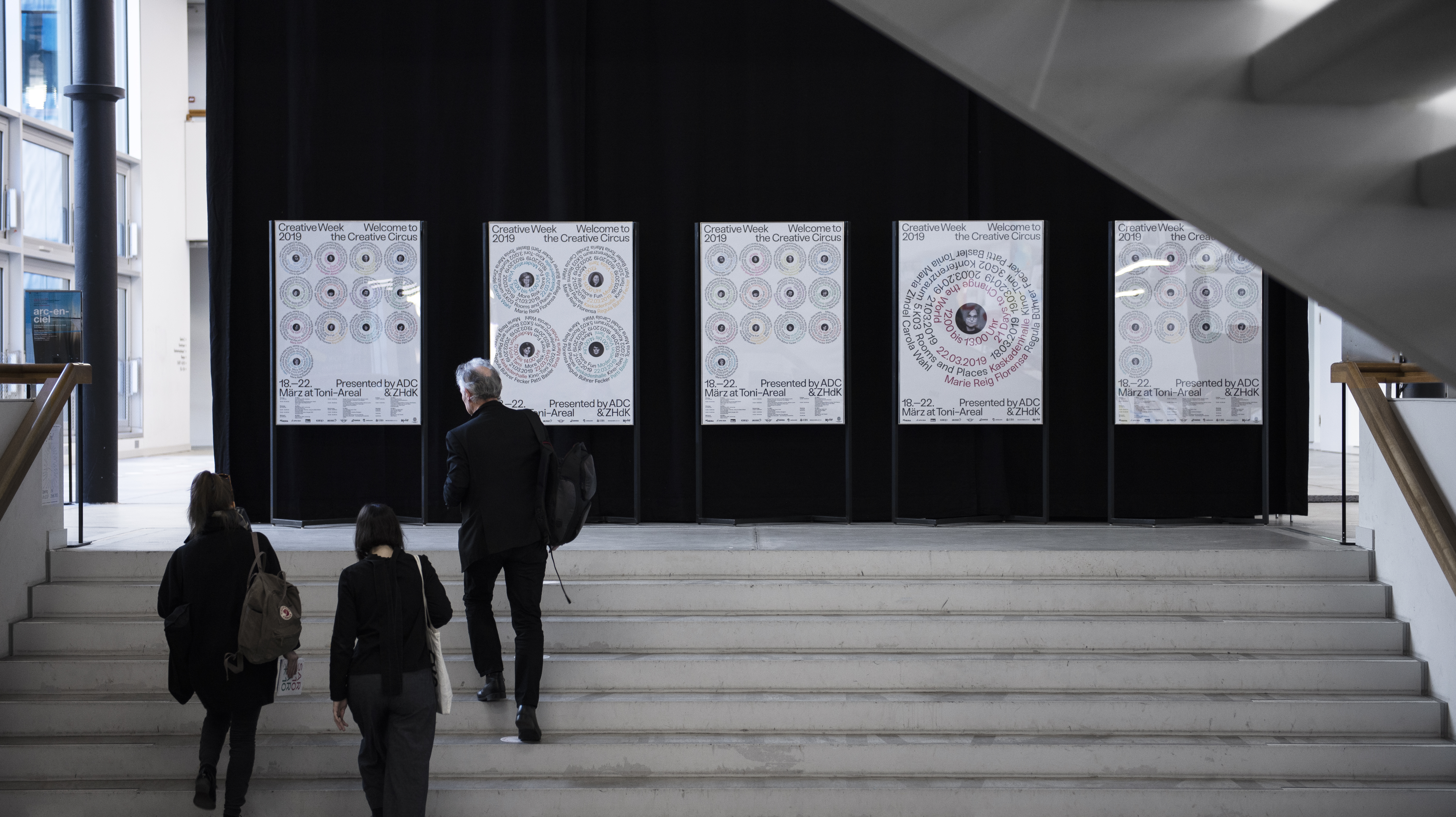
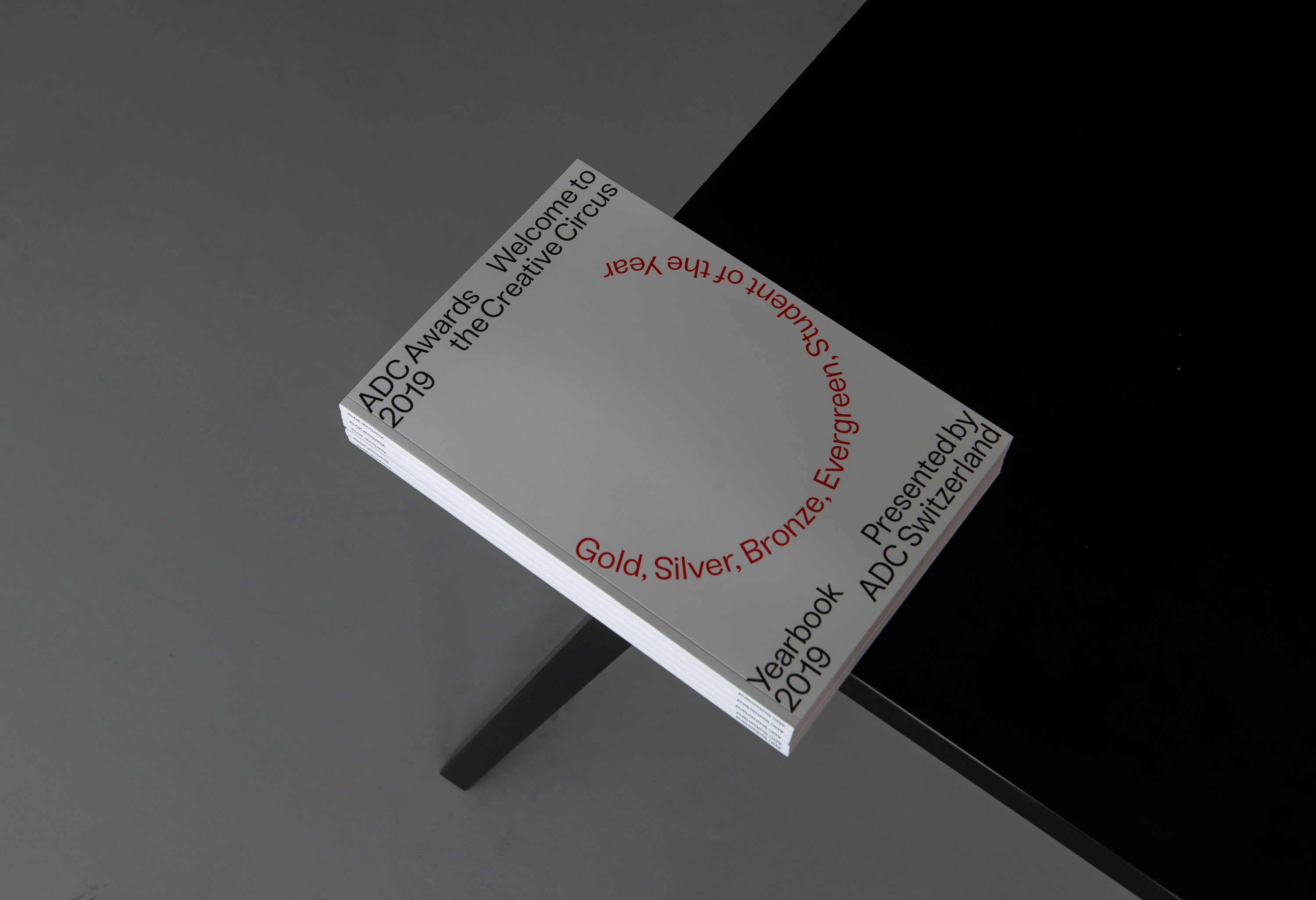
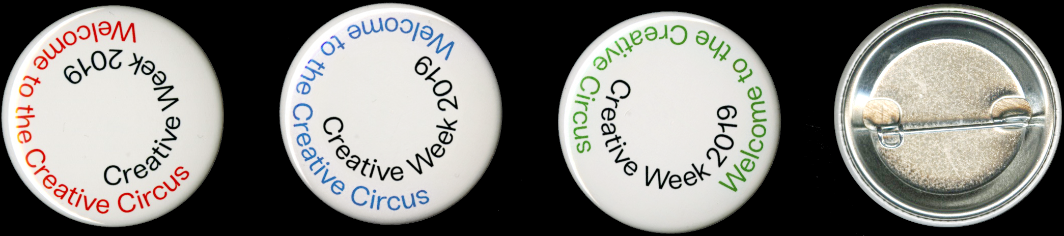
ADC Creative Week
Poster series for Creative Week 2019 presented by ADC Switzerland and ZHdK. The Design brings the theme and the typographical approach curated by the ZHdK together. -
Branding
Posterdesign
Signage -
Collaboration
Stefan Hürlemann
Vilté Jurgutyté
Christian Knöpfel


-
-
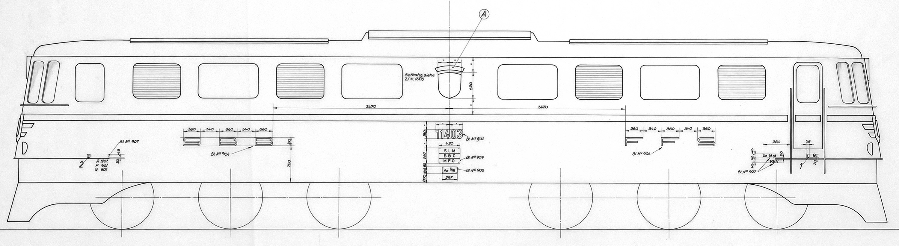
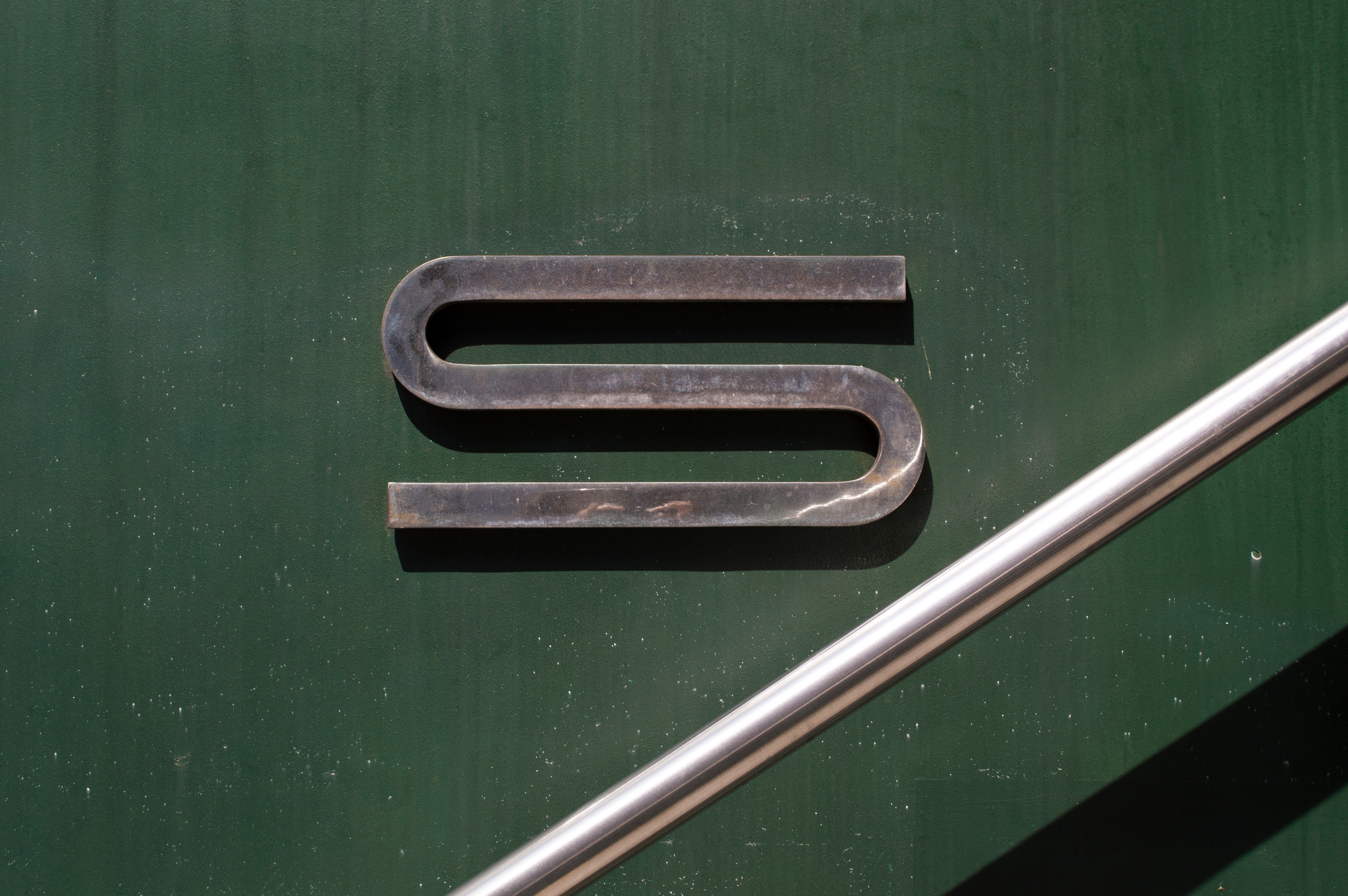
Engine train station trail
-
Bund
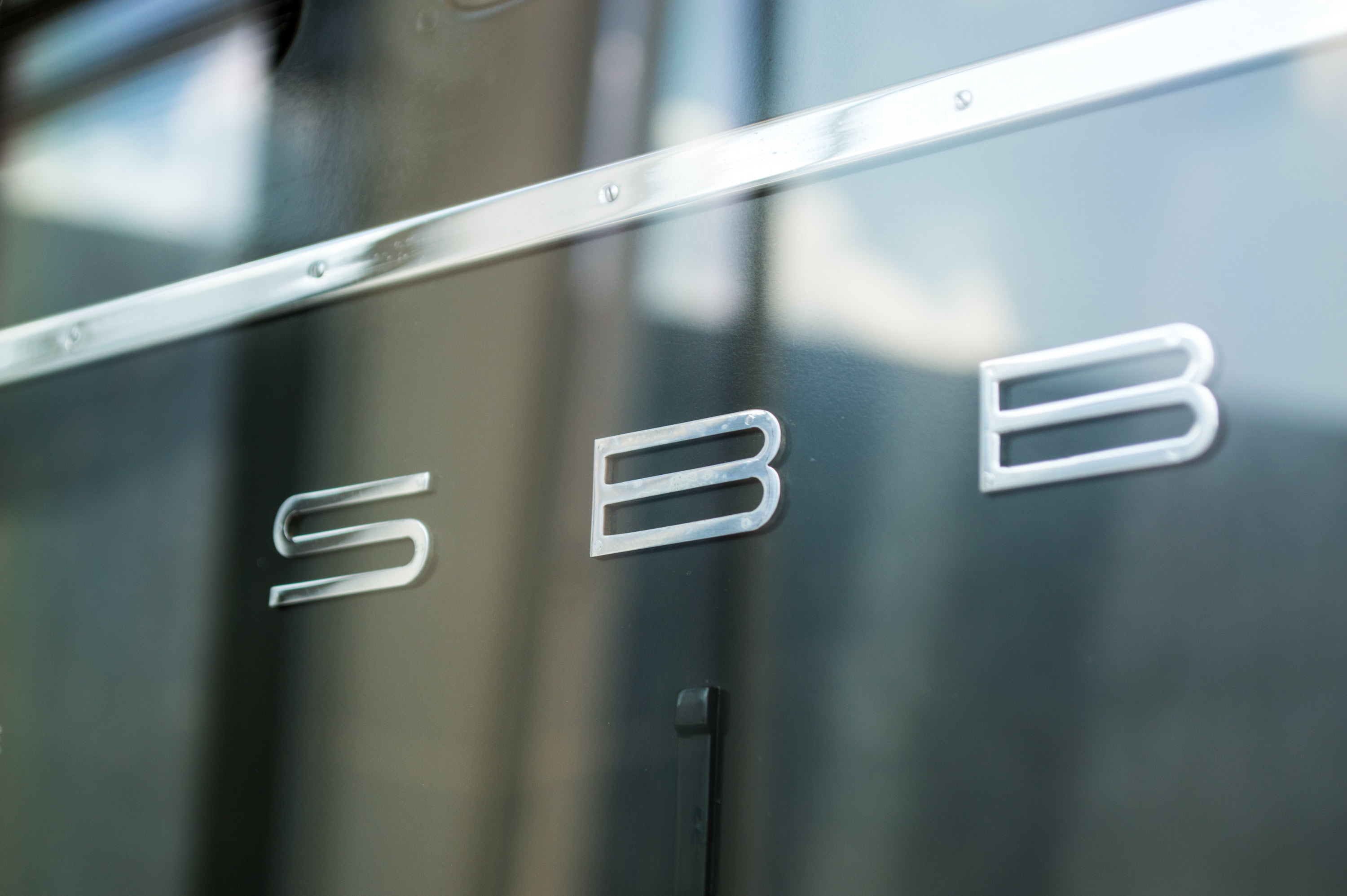
The typeface is inspired by the old SBB logotype. Ernst Keller and his student in the 1950s set off this trend of extremly wide typeface that can even be seen in current logotypes and posters. The extreme extension of the SBB logotype refers to the speed of the trains. These extremes were seldom used and appeared just in selected cases.
-
-
Tempos Mono
newspaper "pool" 3.5 feet Hybrid, carom One-pocket Bank*eight-ball-
Tempos Mono
Inspired by Times Tempos owns a familiar asthetic, together with the monospaced width the typeface blablo

-
-
-
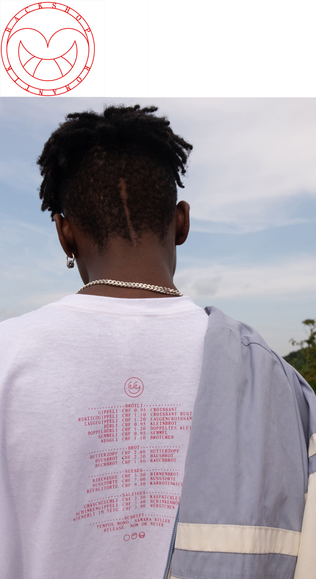
A visit to the bakery shop around the corner reveals the grotesque and the absurd. Contrasts collide. Poor meets rich, young meets old, multi-cultural and cosmopolitan meets bourgeois. The language barrior between Switzerland and Germany are illustrated and show the difference.
-
Screenprinted
Shirt -
Clients
Ana Danik
Stefan Mader
-
-
-
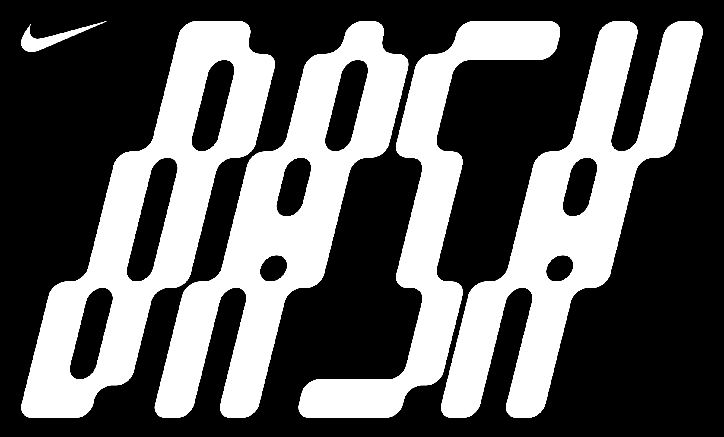
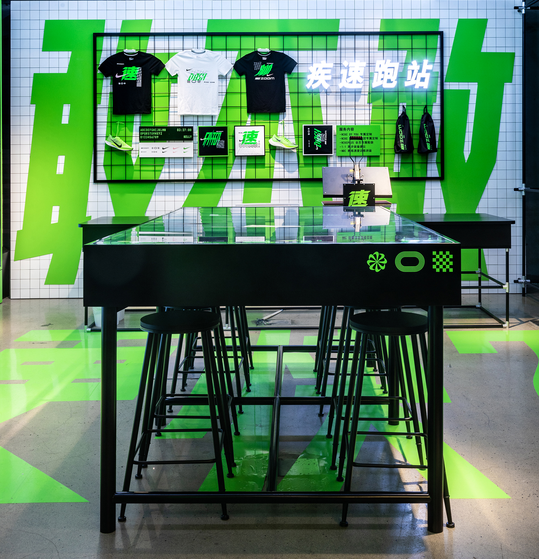
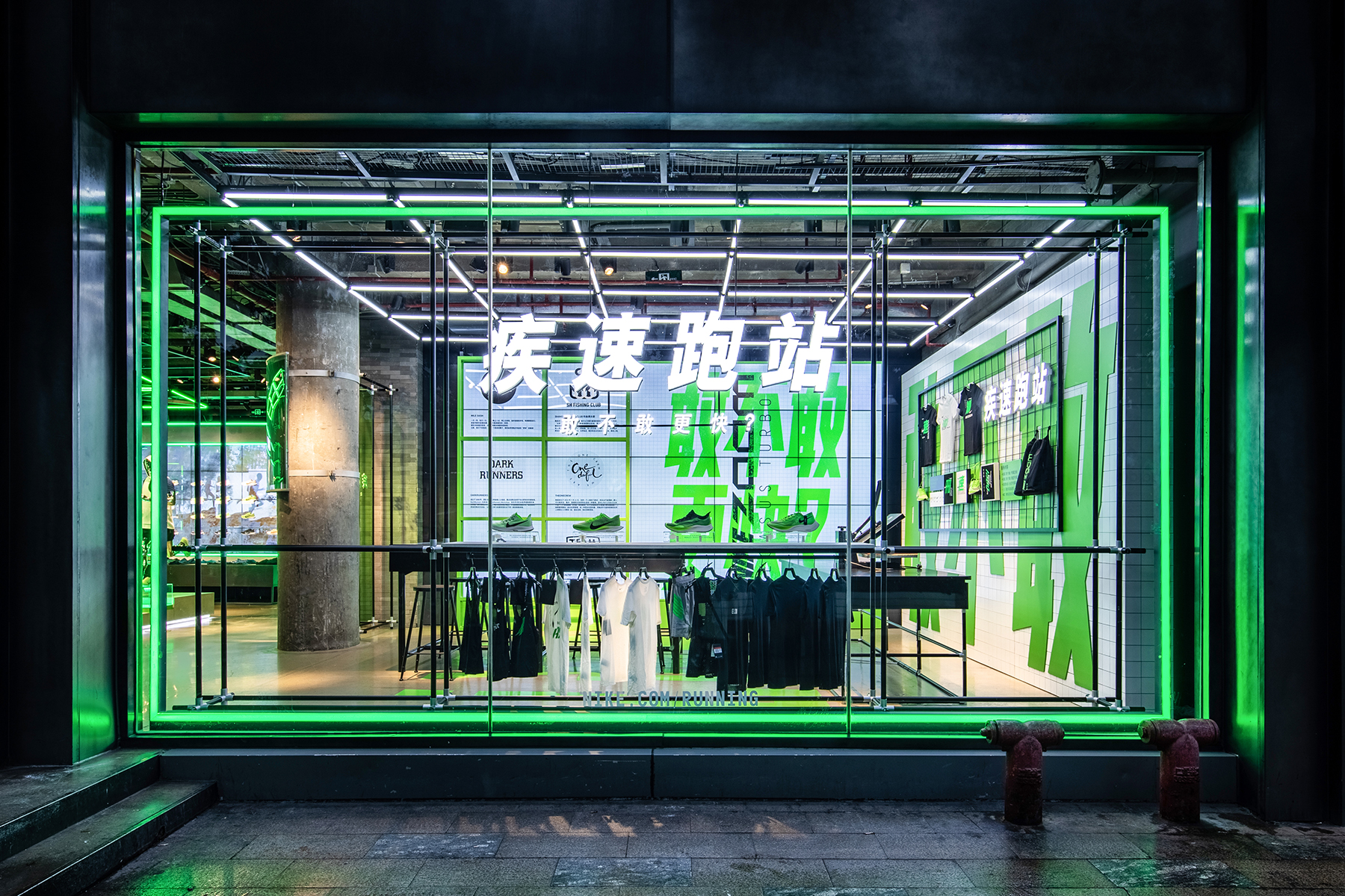
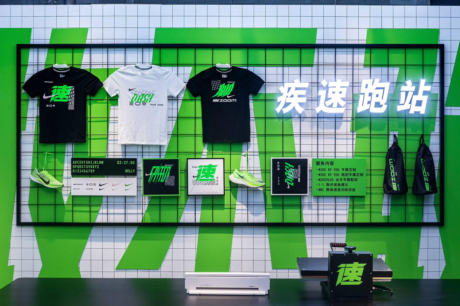
Custom Logotype for Nike China
The printed on shirts are sold in the flagship store, where customers can mix and match the type in their own way on the shirts. The Logotype plays with elements of the Nike Lab and the sporty Lifestyle. -
Printed Shirts
-
Collaboration with
Stefan Hürlemann

-
-
-
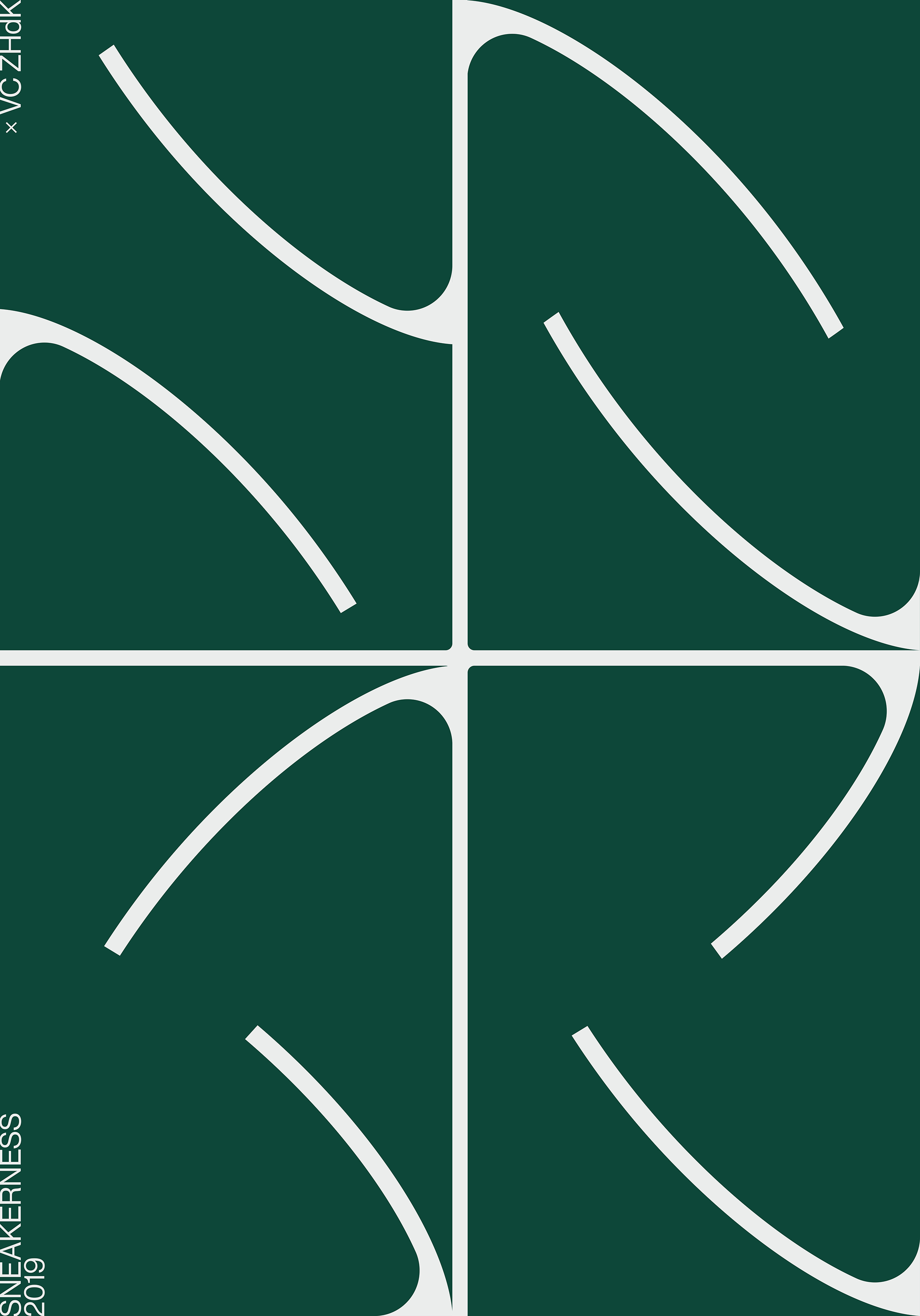
The abstraction of the abbreviation is set in style of a basketball and refers to the early usage of Sneakers mostyl worn by athletes. The title of the poster refers to the cooperation between Sneakerness and the Visual Communication Department of the Zurich University of the Arts and serves as analogy to the custom in the sneaker scene, where athletes or other personalities often design a new shoe together with a brand.
-
Posterseries
-
Collaboration with
Bastien Egger
Vilte Jurgutyte

-
-
-
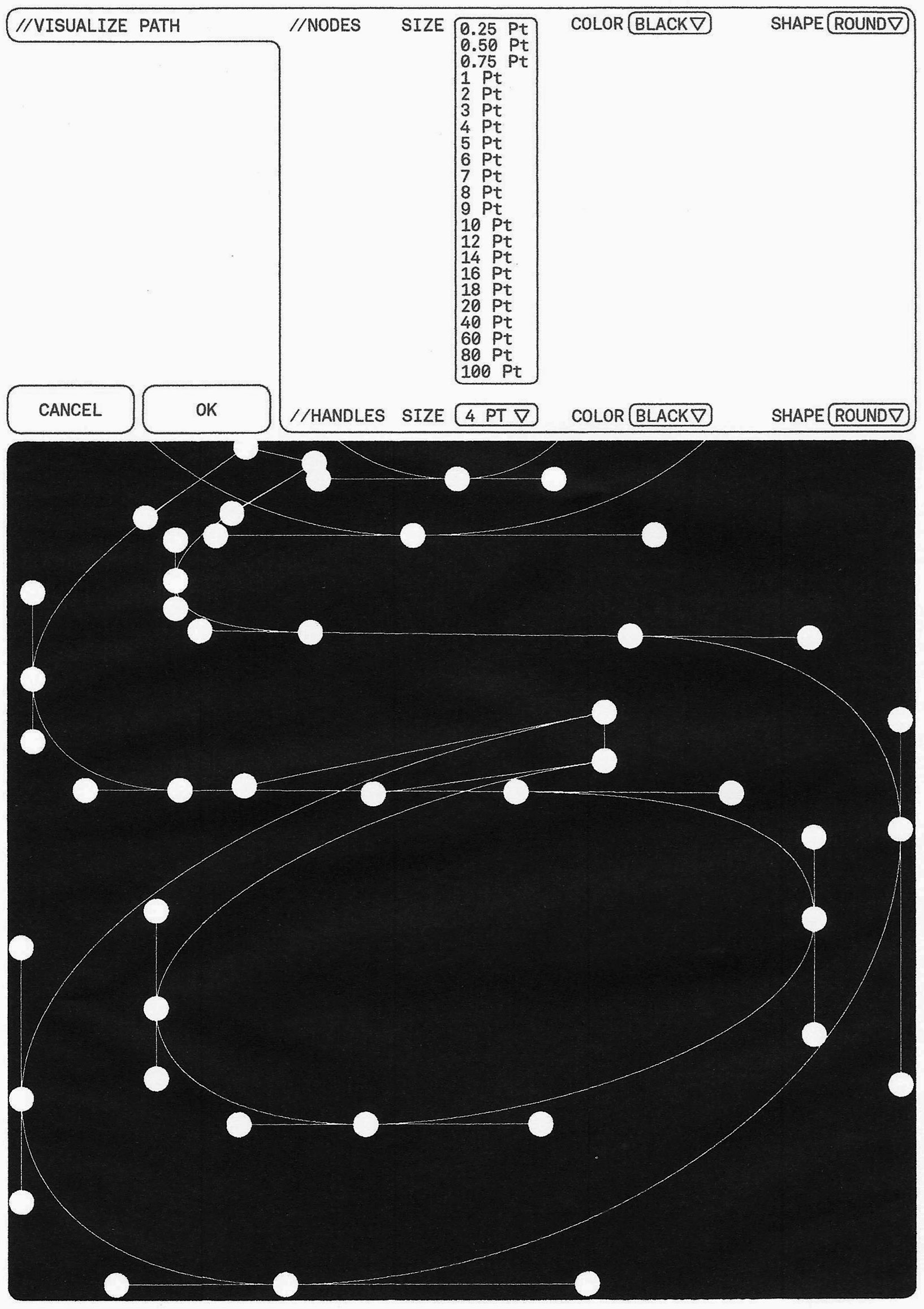
This script is a script that allows generating Handles and Anchorpoints with various kinds of selectors. This is generally used in Typedesign where Handles and Anchor points are commonly shown to give an impression of the curve quality.
-
Illustrator script
CS6/CC - Get it here!

-
-
18:31 Uhr seerund fahrt, StÄdte.
-
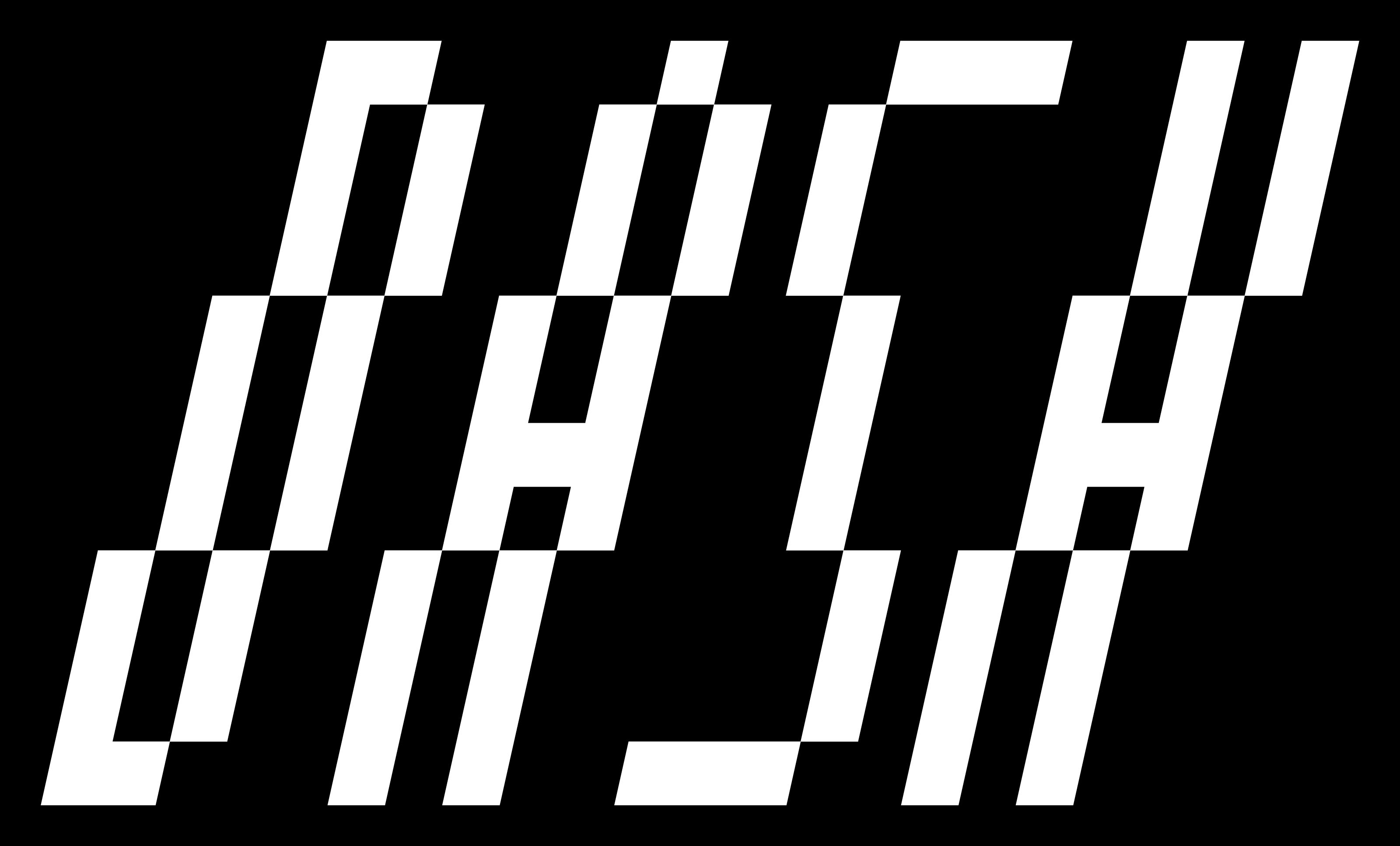
Neustadt
This modern display typeface combines typefaces from digital clocks with blackletter typefaces. Digital watches from the 90ies had a distinctive and uniform style. A special feature of these typefaces was their light slant. At first glance, Gothic typefaces have nothing in common but if one examines the structure there is a clear similarity in grid.


-
-
-
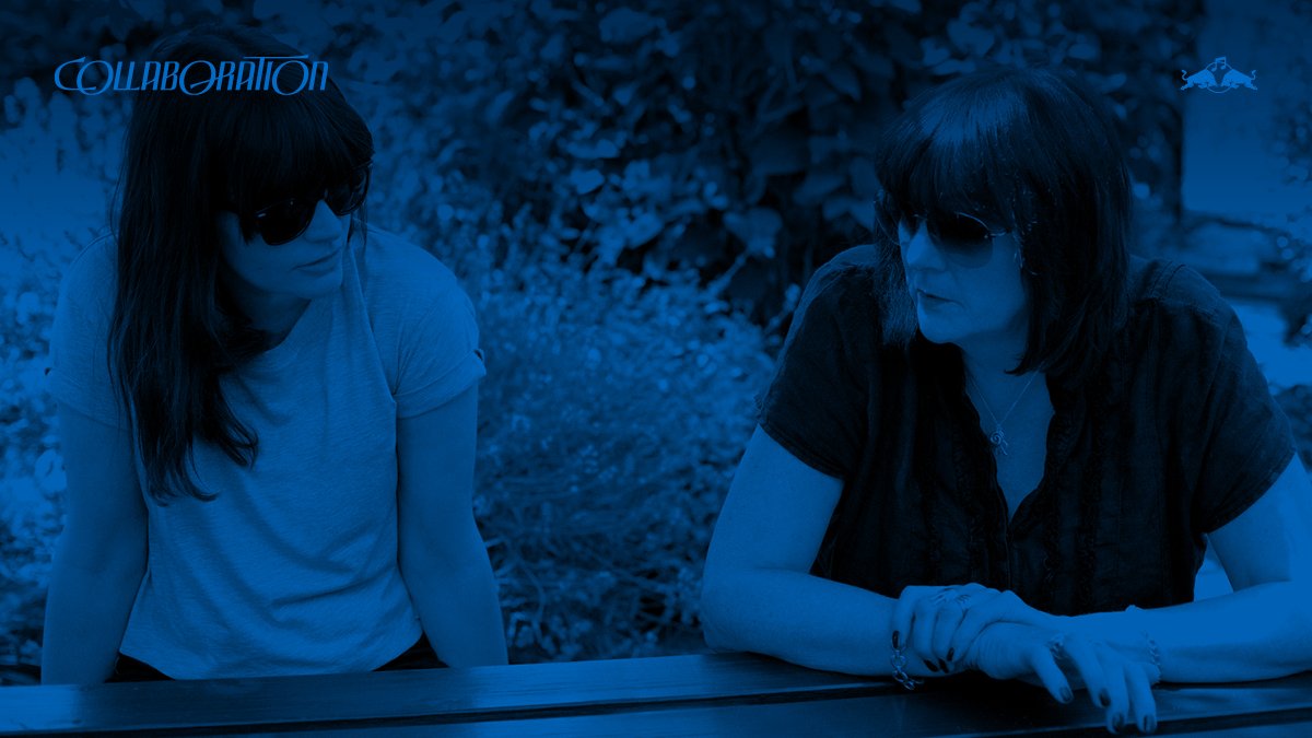
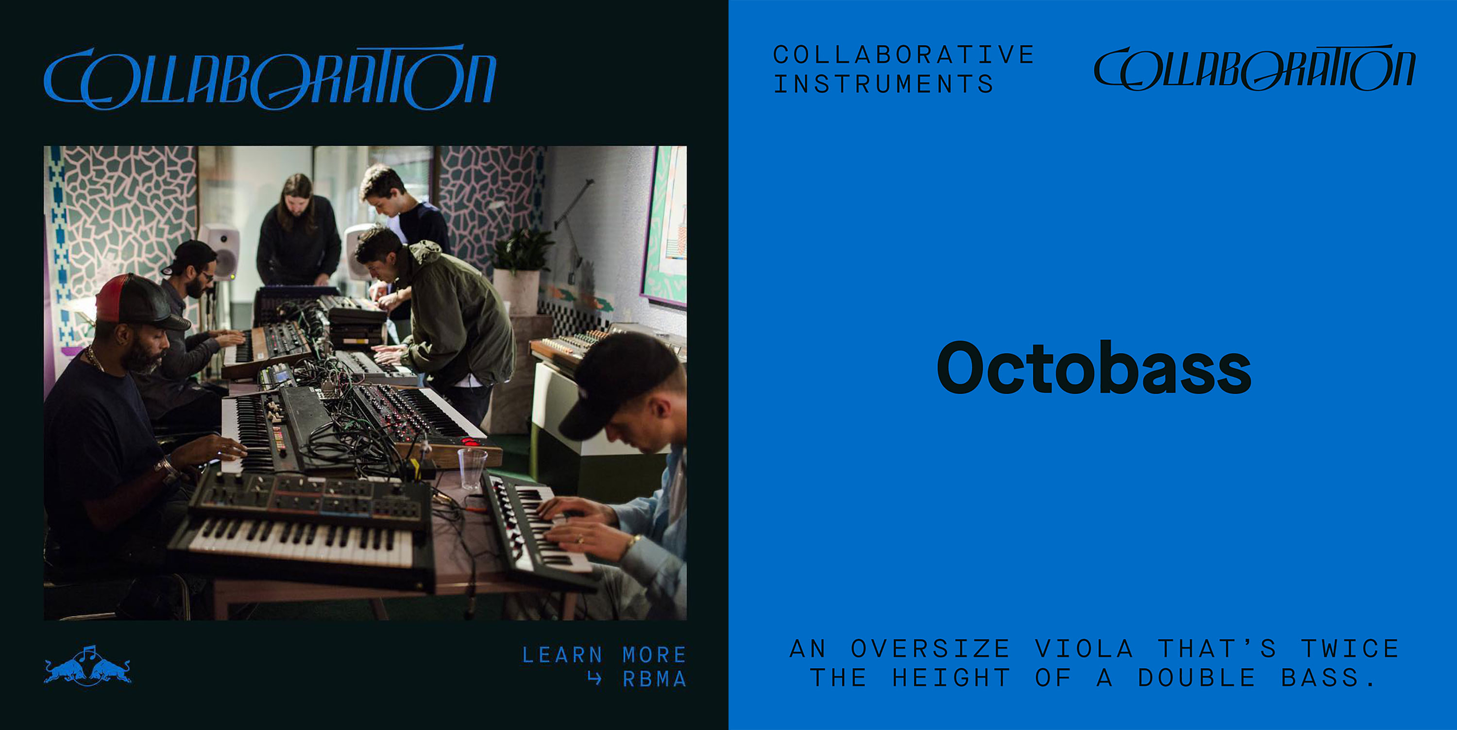
Red Bull Music Academy Daily
The online Platform RBMA Daily creates themed Educational Modules about a topic in music and highlights different aspects of these. The idea of cooperation is shown with a modern interpretation of ornaments. The extensions of the letters flow into each other and is paired with a modern and technological typeface. -
Logotype
-
Client
Red Bull Music Academy Daily

-
-
-
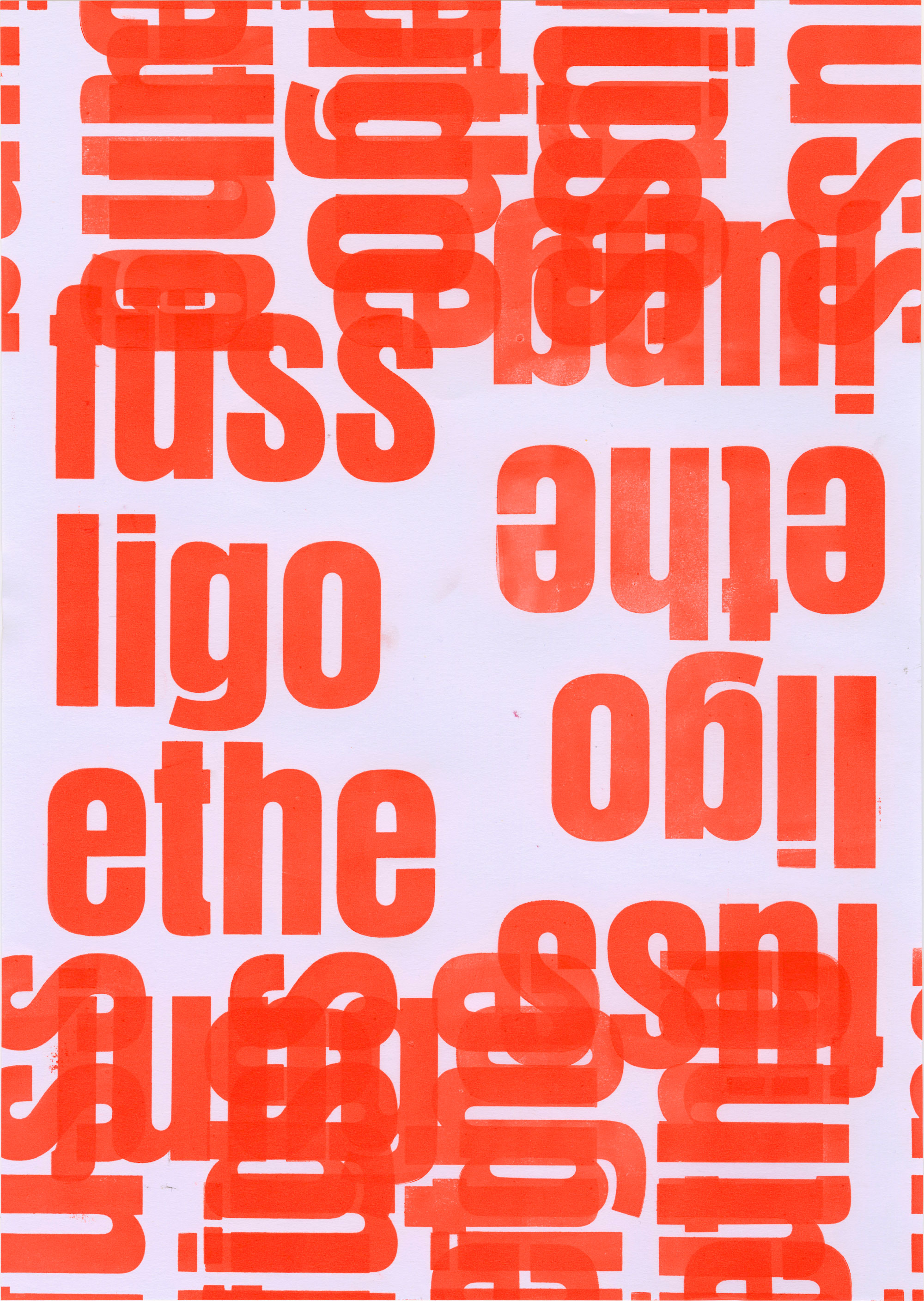
The interplay of Fonts and Coincidences during the printing process creates a new visual language and elevates the possibilities that arent possible with digital methods.
-
Handprinted in Letterpress
-
Evening course guided by Rudolf Barmettler


-