-
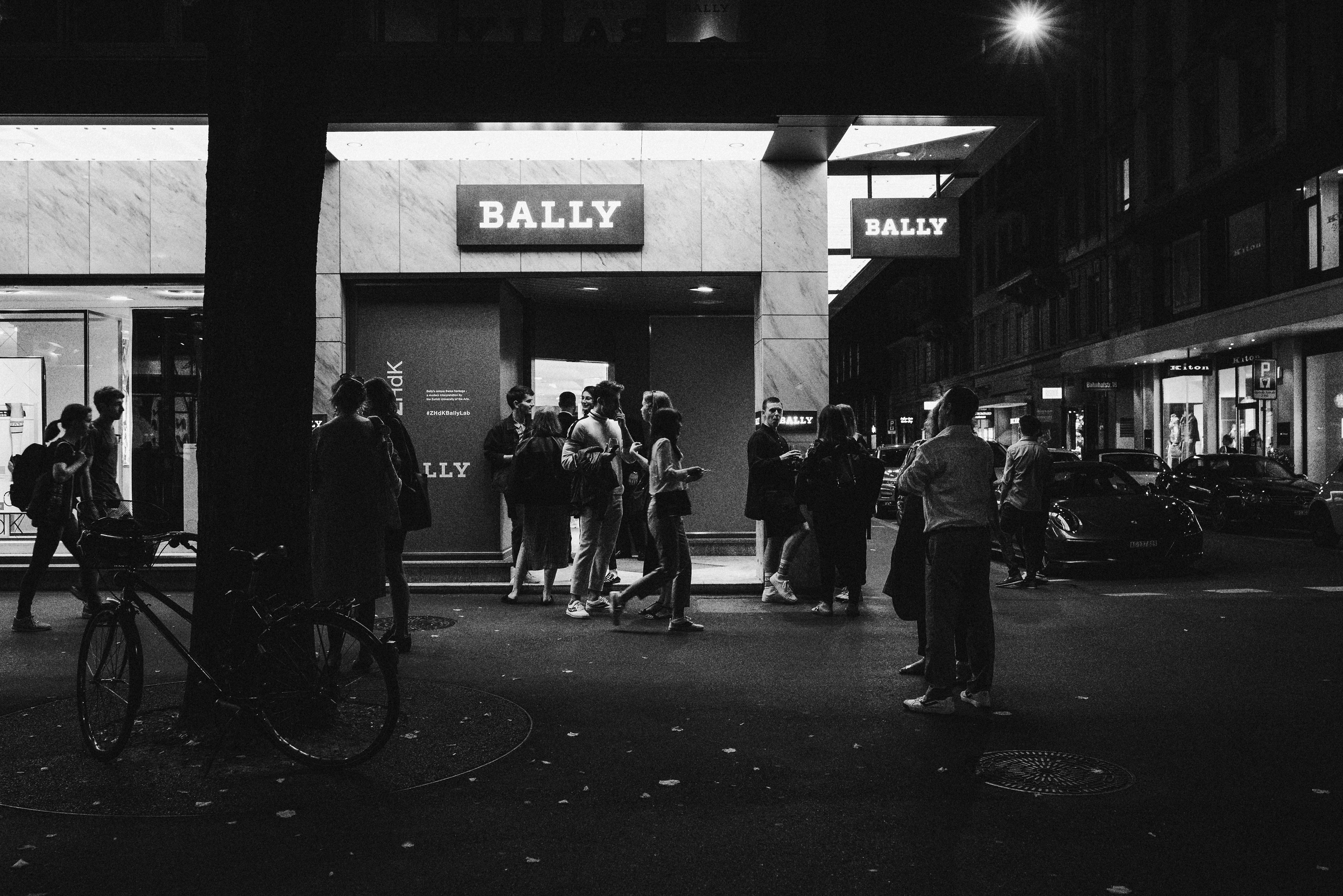
BALLY
is a well known Swiss fashion brand which organized a competition between design students to create a series of animated posters for their last Autumn-Winter collection of Retro Bally sneakers. The project was developed in cooperation with Sara Nygard, Anina Weidmann and Serafin Gerber. The concept was to create a mix between hight-resolution marco-shoots of Bally shoes and 3D animated sculptures, showing the interaction between eye-catching details and new technologies. As the winners of a this competition our team got a chance to represent our work in one of the biggest stores of Bally at Bahnhofstrasse in Zürich in September 2018.
-
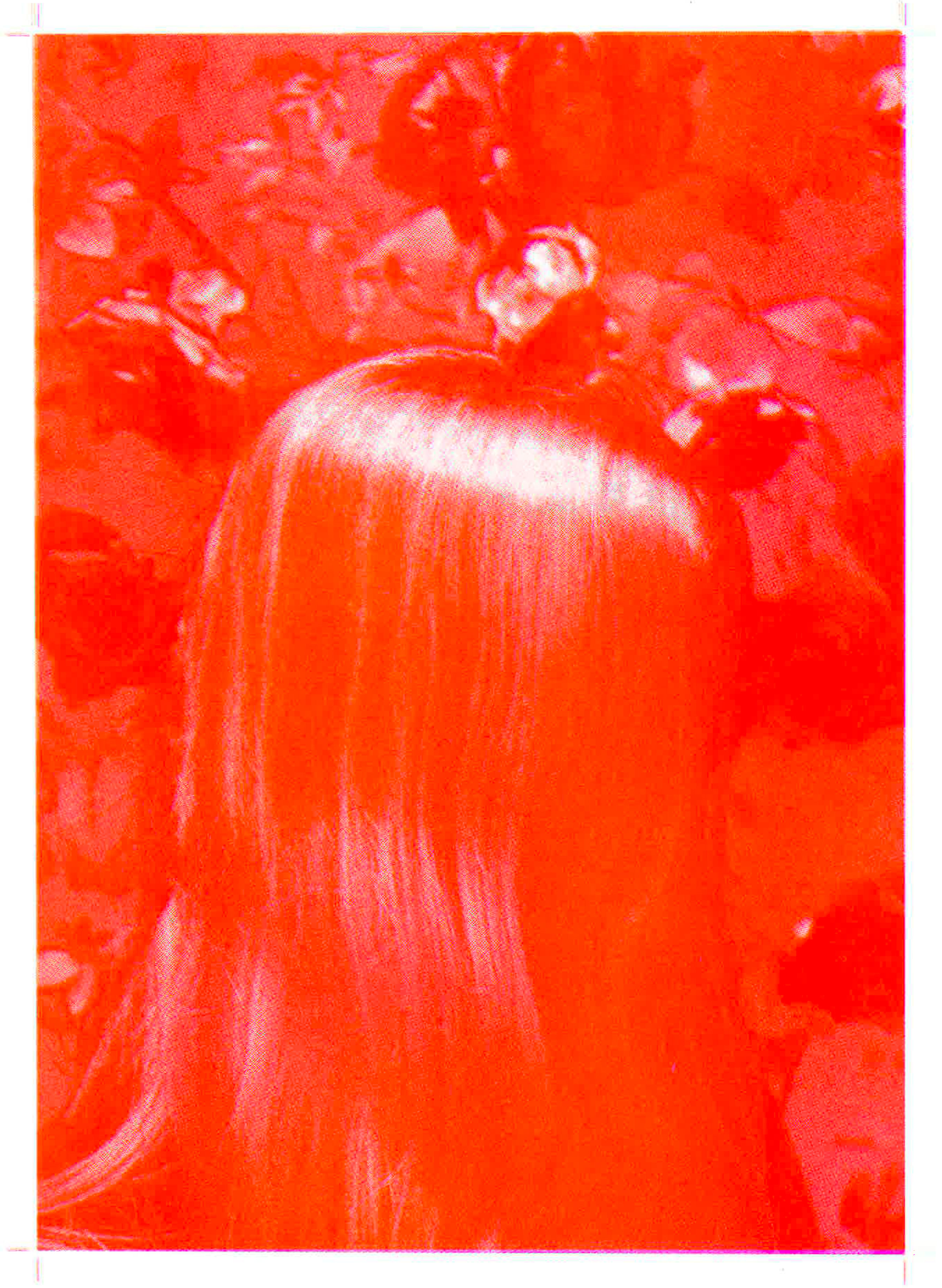
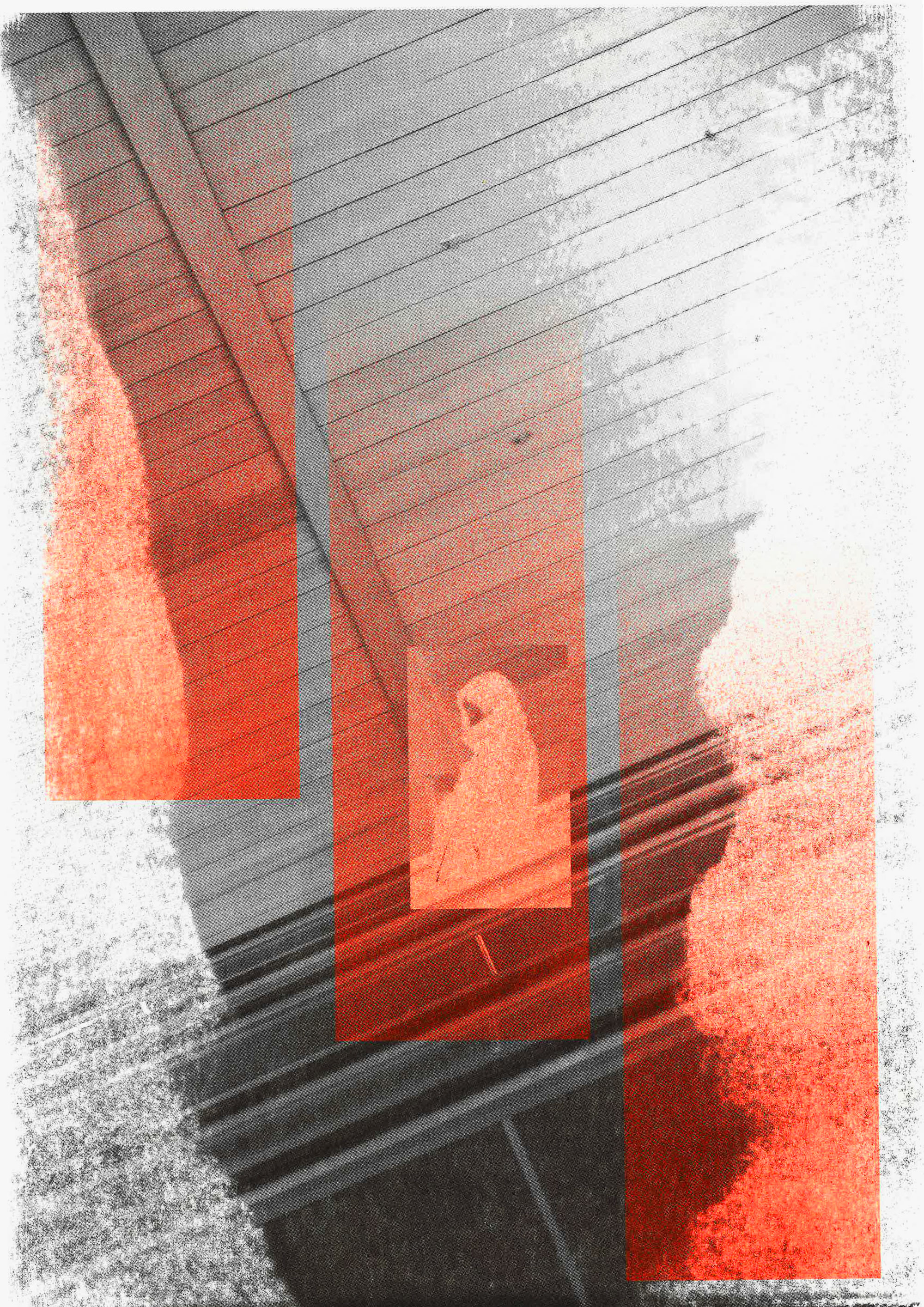
RISO
is an experimental technique of printing, which I used for doing a small A5 format Zine called "Neon Cities" and experimental F2 poster. The idea of the project was to expore the world of Riso, experimenting with layering the objects over each other, playing with grid points and neon colors. The beauty of it is that the final result was very unpredictable, which made the working process very exiting.
-
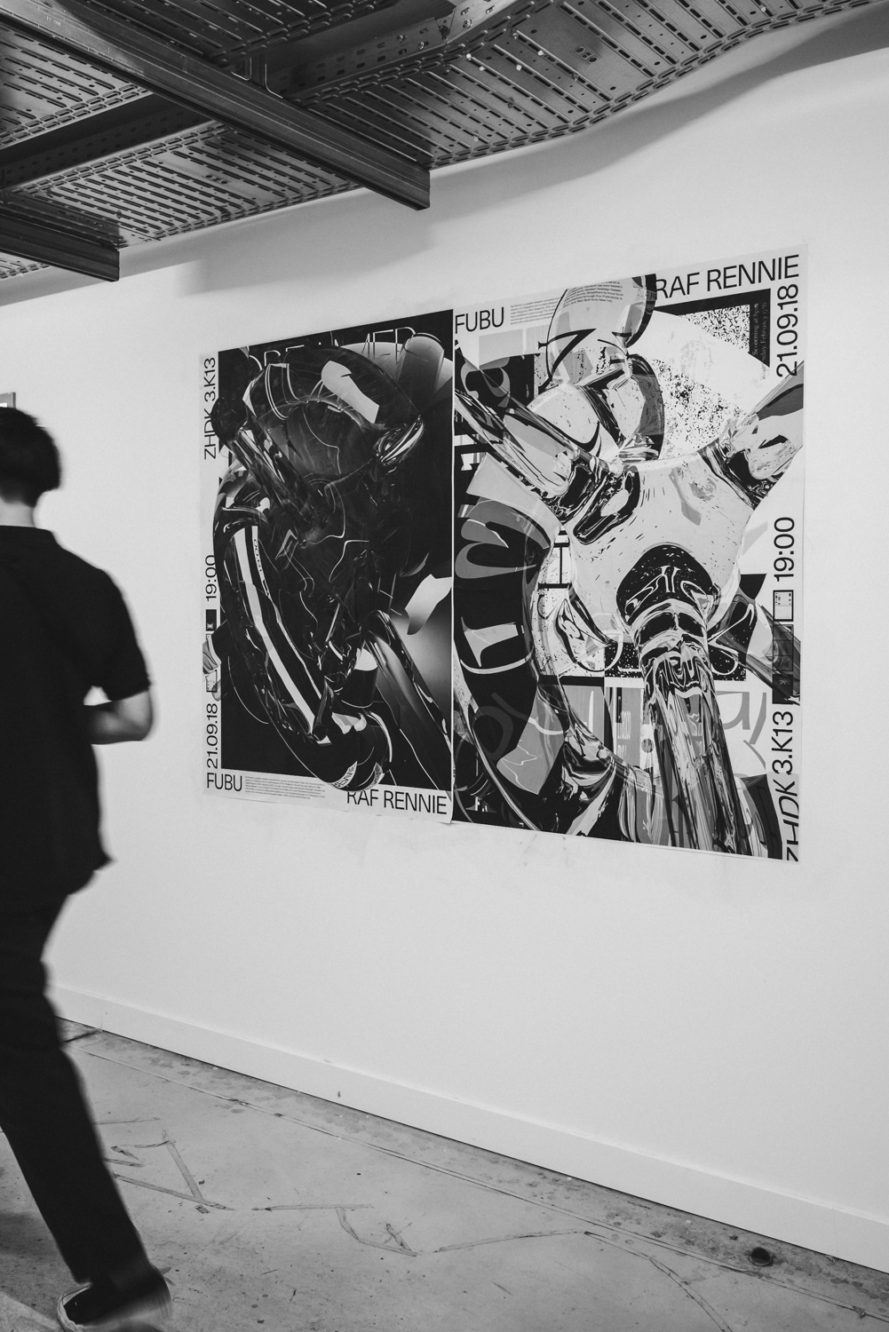
FUBU
is a student organized series of talks and lectures, hosted by second year students of Visual Communication Design Department. This project was made in cooperation with Stefan Hürlemann, Tanja Krebs and Laurence Hau. The idea of it is to organize an event, inviting famous/interesting/new designers/illustrators/photographers to give a talk to students, explaining their way of working, interests, insprirations and explaining how they came to their success. As hosts, my team had to work on a visual identity of this event, starting from informational posters, finishing with instagram/facebook promotion. The photos show the posters, which were created for the last event hosted by Raf Rennie. The idea of the posters consists of two main components: we took several posters from the designers as a base element mixed and layered them over each other, as a second element we took the graphic elements, which Raf uses often in his work and composed it into 3D elements, using Cinema 4D for it.


-
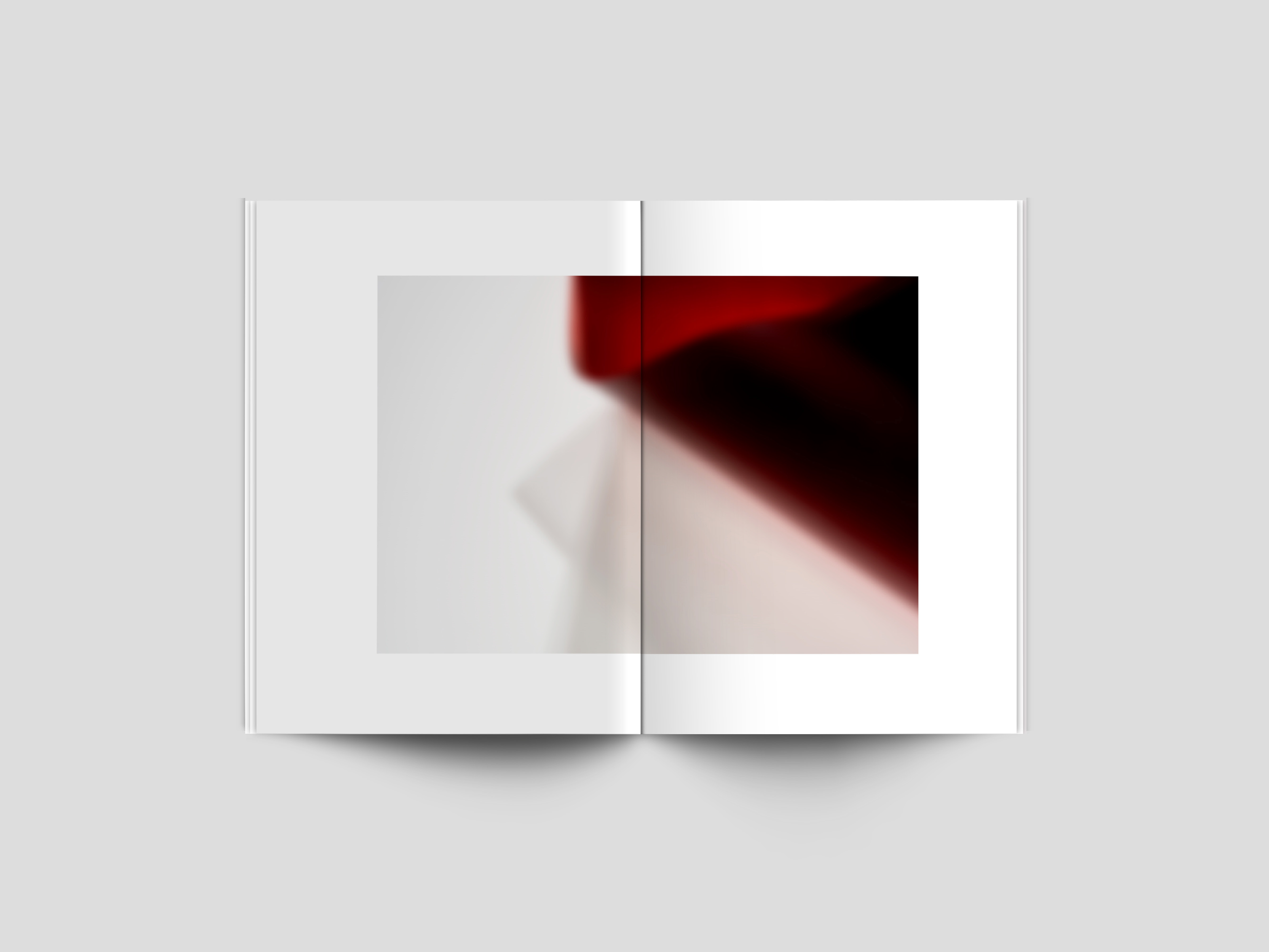
EDITORIAL
is an interpretation of the essay written by Junichiro Tanizaki called "In Praise of Shadows" in 1933. From text analysis I defined the main theme for myself which i called "Sexual Outtakes". Even though the text of the essay describes the interaction between light and shadows, the author used a lot of sexual adjectives in it. It brought me to the idea to compose them in a small black pocket book of A5 format. To make the impression of the text stronger I combined it with blurred abstract images, which were taken in a studio.

-
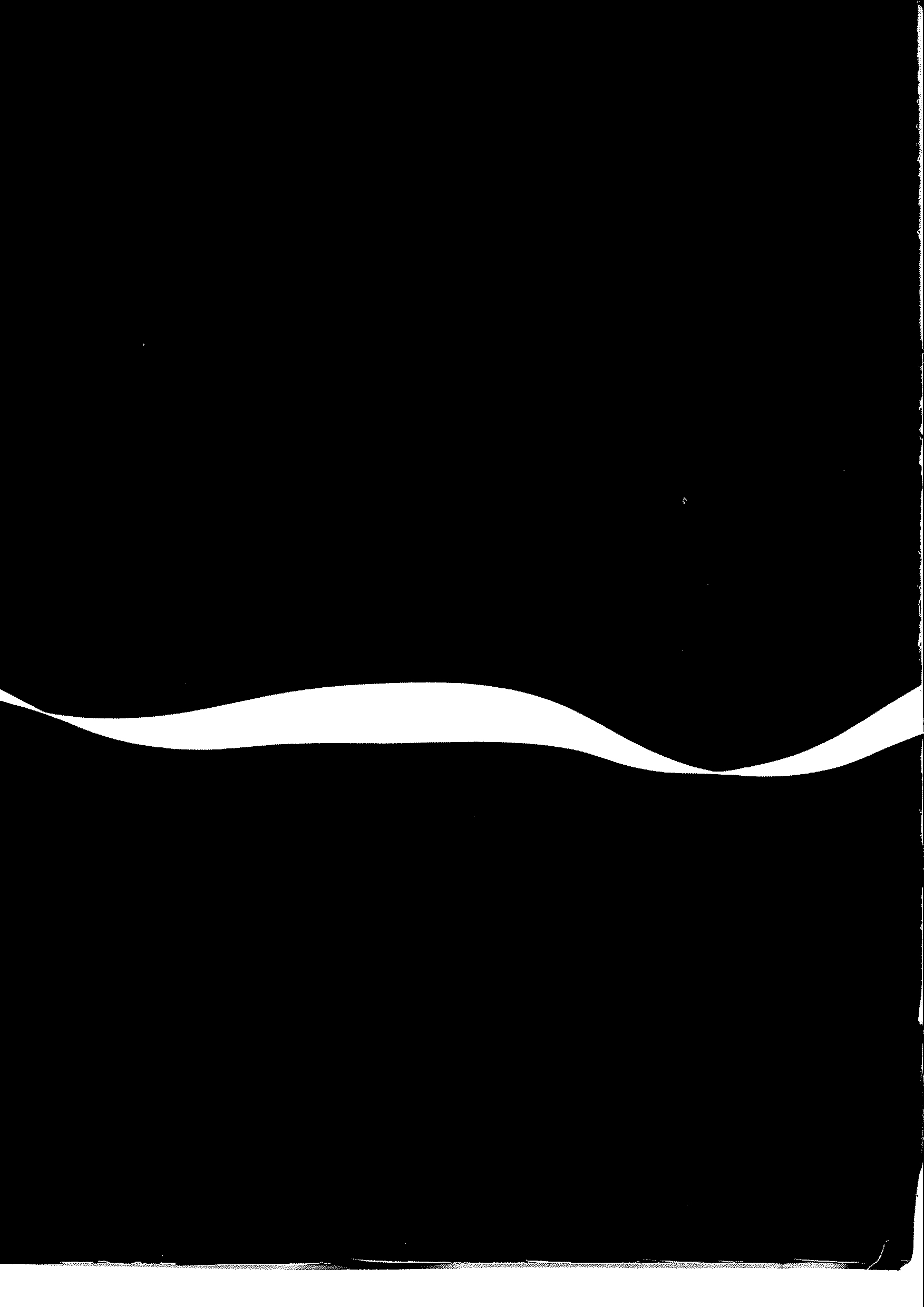
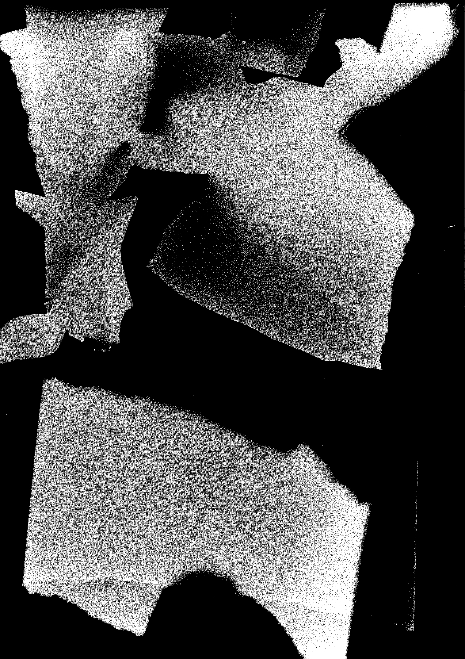
PHOTOGRAPHY
the images below are the first try-outs in the world of digital and analog photography. The project idea was to take a very simple object and make something beautiful out of it. As the main object i chose different samples of paper. The play of light and shadow turned them into surrealist objects.


-
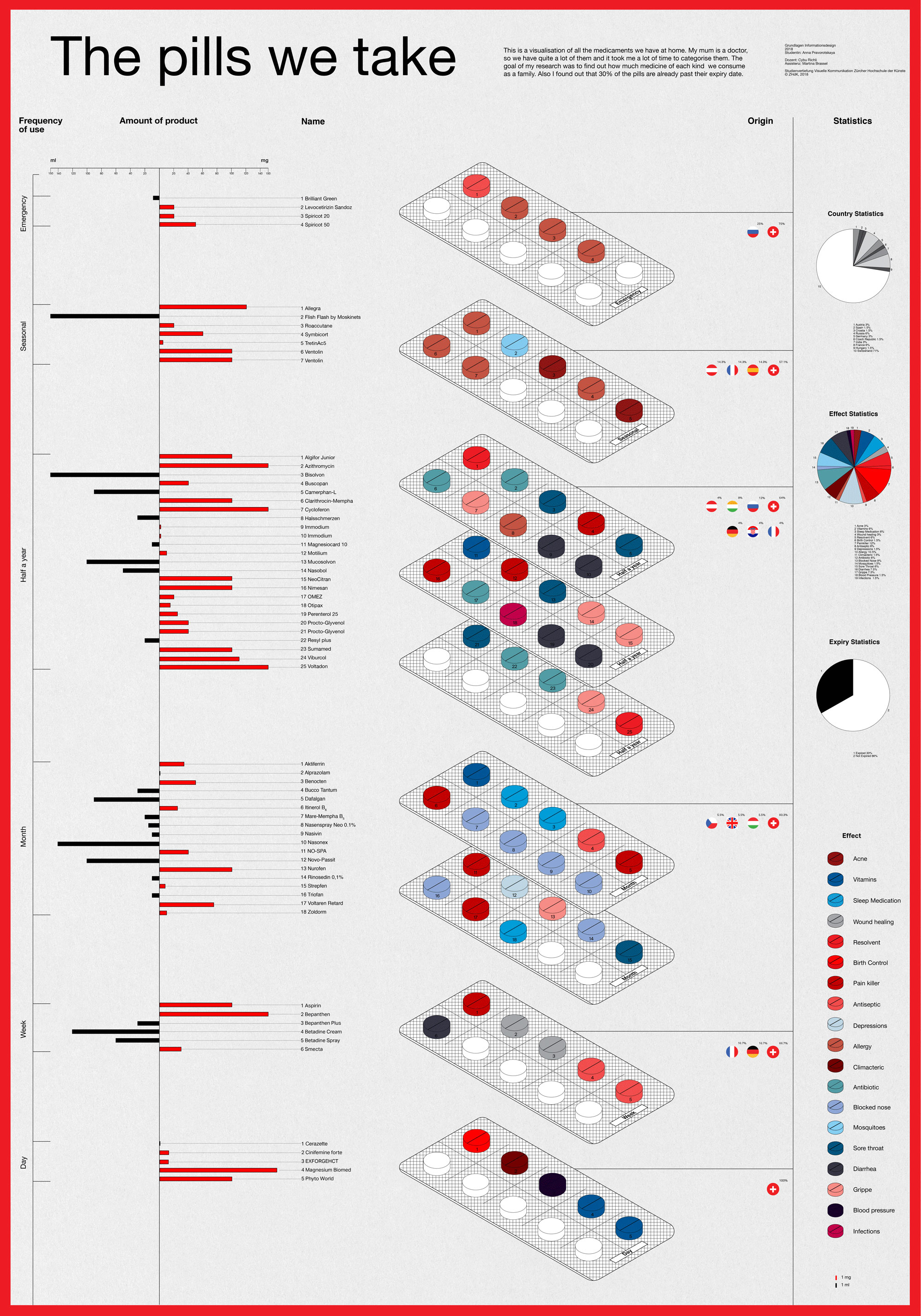
INFOGRAPHIC
shown below describes all the medicine me and my family have collected at home through several years of life in Switzerland. The main idea was to show the analytics of how much medicine we regularly use on a daily/weekly/monthly base, the effect of the pills, how much of it we actually need and how much medicine is lying here expired, without any need. In the right column you can see the overall statistics about the countries where the medicine was produced, the amount of pills which are already expired at the moment and the statistics of illnesses which are the most common in my family. The color system is used to better define the effect of the pills. The Infographic is printed on F4 format.